

Search Results for: original design
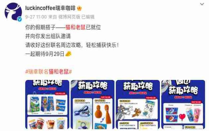
Luckin Coffee's Tom and Jerry collaboration cup features a three-eyed Tom—design coincidence or intentional?
Luckin Coffee's annual October collaboration with "Tom and Jerry" has become a regular fixture, and this year is no exception. Two new drinks, "Milk Skin Latte" and "Raw Coconut Mango Pomelo Sago," launched alongside limited-edition merchandise, and stores nationwide switched to Tom and Jerry-themed packaging. However, some customers discovered upon receiving the actual products that the Tom and Jerry printed on the cups actually had three eyes. This abnormal design quickly sparked discussion: was it a printing error, or was it intentional by the brand? Some fans dug up animation screenshots to prove it was a faithful reproduction of exaggerated expressions, while others suspected it was a mistake made by AI design. More critically, the three-eyed design was not the first of its kind—Soap Studio's collaboration with artist Greg Mike and Uniqlo's collaborative T-shirts had both used similar designs. This debate over the cups reflects the subtle tension between artistic expression and public perception in IP collaboration design. [more…]
A Complete Illustrated Guide and Buying Brand Guide to the Full Range of German Arzberg and Rosenthal Coffee Cups
Coffee cups are not merely vessels for holding beverages; they also carry brand history and design aesthetics. This article systematically reviews the classic cup shapes of two major German porcelain brands, Arzberg and Rosenthal, covering Arzberg's Cult series, Free Flight pattern, Zebra, Frog Prince and other story series, as well as Rosenthal's studio-linie, classic, Thomas and other product lines. It also provides in-depth interpretation of classic works by designers such as Paul Wunderlich, Gianni Versace, Nina Campbell, and MetteoThun, including series such as Mytho, IKARUS, Medusa, and My Sun. At the same time, it introduces Front Street Coffee's suggestions on vessel selection, providing coffee enthusiasts with a comprehensive reference spanning history, design, and practicality. [more…]
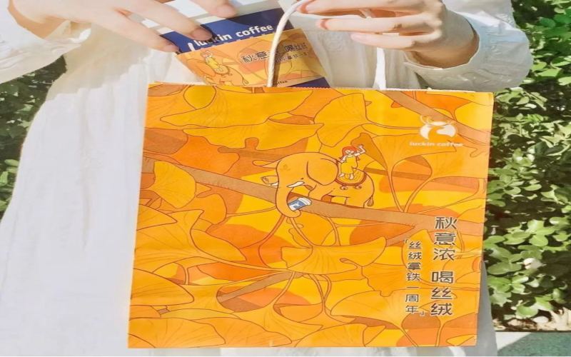
Why does Luckin Coffee's packaging design keep going viral? The brand communication logic behind paper bag secondary creation.
After finishing a cup of Luckin Coffee, the taste may soon be forgotten, but the paper bag is often kept. In recent years, Luckin has continued to attract consumer attention through its packaging design. From co-branded editions to seasonal limited editions, from coffee-region themes to holiday specials, materials such as paper bags and cup sleeves not only serve a containing function but have also become carriers that consumers spontaneously collect, repurpose, and share. This article analyzes how Luckin uses a single piece of paper to achieve deep interaction between the brand and consumers from the perspectives of design strategy, environmental philosophy, and social communication, and explores brand development ideas that independent coffee shops can learn from. [more…]
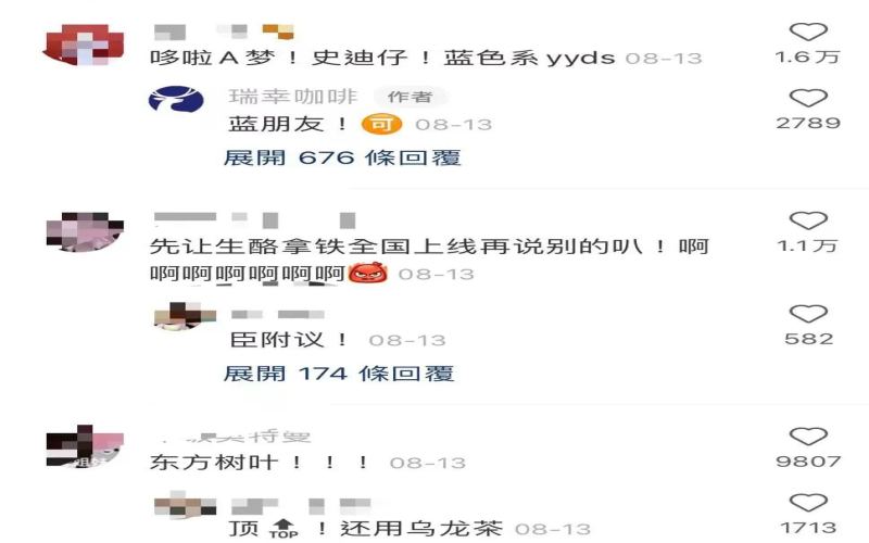
Luckin Coffee's collaboration with JoJo's Bizarre Adventure: Stone Ocean on packaging design has sparked heated discussion, with netizens creating their own works to express differing views.
Recently, Luckin Coffee's co-branding campaign with *JoJo's Bizarre Adventure: Stone Ocean* sparked widespread discussion among netizens, especially JoJo fans, before its official launch due to an internal "spoiler" of the packaging design. The collaboration, which had been highly anticipated, left some netizens disappointed because the design style fell short of fans' expectations. However, some netizens found the design acceptable and spontaneously created their own fan art, showcasing more popular DIY versions. This article will provide a detailed recap of the incident and present the diverse reactions and creative designs from netizens. [more…]

The latte art roulette wheel's pointer decides the design, and the barista's stress instantly maxes out
The reason hot lattes captivate so many coffee lovers often comes down to latte art. Tulips, swans—a beautifully poured design never fails to lift the mood. Most of the time, the pattern is left to the barista's discretion, but some baristas compile a menu of designs for customers to choose from. With so many options, some people find themselves spoiled for choice, and so the latte art spinner was born—the customer gives it a gentle spin, and wherever the pointer lands, the barista crafts that design. It's as fun as opening a blind box. The customer has a great time, but the barista may be breaking into a cold sweat: if the spinner lands on a complex pattern they haven't quite mastered, a botched pour would be pretty embarrassing. [more…]

From Visuals to Emotions: An In-Depth Interpretation of Coffee Packaging Design Trends and Creative Cases
In today's world, where consumer decisions increasingly rely on visual perception, packaging design has become a key touchpoint for brands to establish a first impression with customers. Excellent coffee packaging must not only possess strategic thinking but also integrate popular aesthetics, allowing the target audience to develop recognition and emotional resonance. This article examines representative coffee packaging cases from multiple dimensions, including character imagery, hand-drawn illustrations, gift coffee, can design, and takeaway paper bags and cups, exploring how different design approaches convey functional features and brand philosophy, and revealing current trends in coffee packaging. [more…]
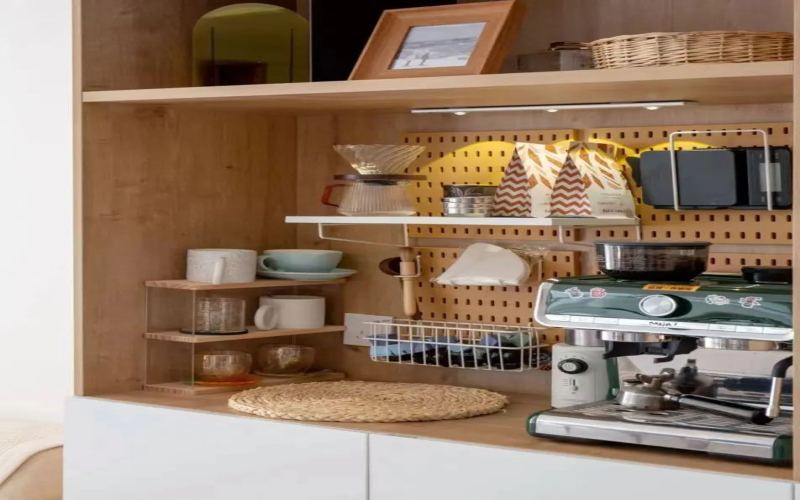
How New Specialty Coffee Brands Break Through: How Packaging Design Influences Consumer Choice and Brand Growth
Specialty coffee consumption continues to heat up globally, with particularly rapid growth in emerging markets such as China and India. Buying coffee beans online has become a new trend, new brands keep emerging, and market competition is becoming increasingly fierce. Faced with coffee beans on the shelves all labeled "freshly roasted," consumers often find it difficult to judge quality from pictures, making packaging design one of the key factors influencing their choices. However, packaging is only the first step in attracting new customers. What truly determines whether a brand can develop over the long term is a sustainable philosophy, an authentic brand story, and consistently excellent coffee quality. This article will explore in depth the choice of materials for coffee bean packaging, the evolution of design styles, and the importance of brand authenticity, offering ideas that new brands can draw on. [more…]
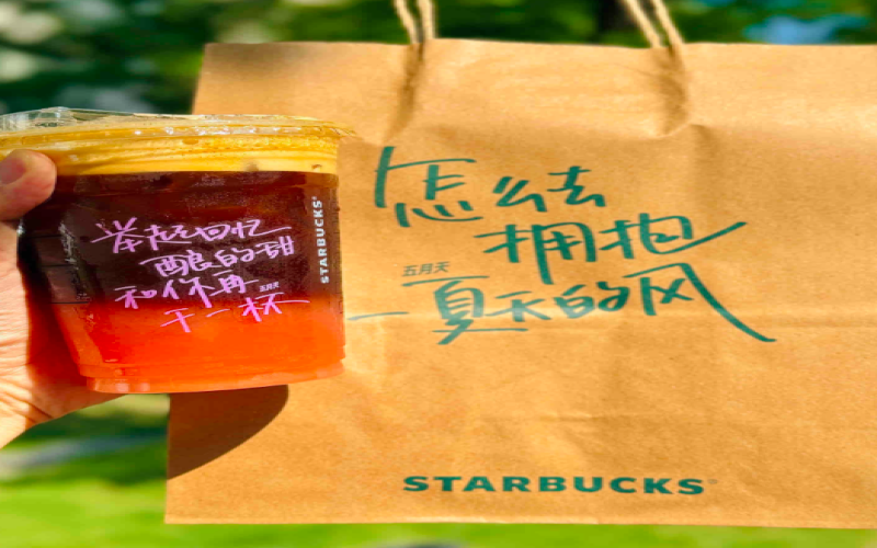
Starbucks Mayday Lyric Cups Draw Criticism: Labels Cover Designs, Duplicate Styles, Fans' Collecting Experience Diminished
Starbucks has once again teamed up with Mayday to launch a co-branded campaign, rolling out a Bergamot Grapefruit Sparkling Americano and themed limited-edition cups printed with classic Mayday lyrics. It should have been a grand occasion for fans to celebrate. However, after the campaign kicked off, many consumers took to social media to air their complaints: the drink labels happened to be stuck right over the lyric designs, and the residue was hard to remove after peeling them off; those who bought multiple cups in one go received the same design, dashing their collection plans. The brand and store staff have responded with explanations, saying the labels should be placed in the notes section, while the identical cups were due to stores needing to use up inventory in sequence. Is this collaboration full of sincerity or a failure in the details? Front Street Coffee walks you through the whole story. [more…]
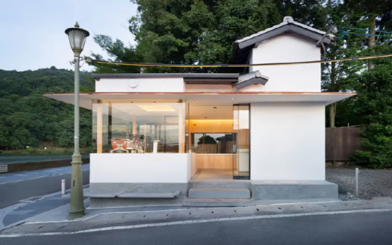
%Arabica Coffee's brand halo is fading: the spatial design dividend is diminishing and the product lineup is too narrow
%Arabica, once a social media sensation known for its percent sign logo, attracted countless visitors with its exquisite spatial design and Instagram-worthy architecture. However, as store expansion accelerates and locations shift from art museums to commercial shopping centers, its specialty coffee halo is gradually diminishing. Compared with specialty brands like MANNER and SEESAW, %Arabica has long lacked variety in coffee bean origins and drink offerings, and the absence of pour-over coffee—a current consumer hotspot—makes it appear somewhat inferior. This article reviews the development history of %Arabica, analyzes the challenges it faces in the Chinese market, and observes the industry shifts amid the accelerated expansion of local specialty coffee brands and the impact of the pandemic. [more…]
Six Major Coffee Bean Packaging Design Trends in the Post-Pandemic Era: From Serene Minimalism to Playful Whimsy
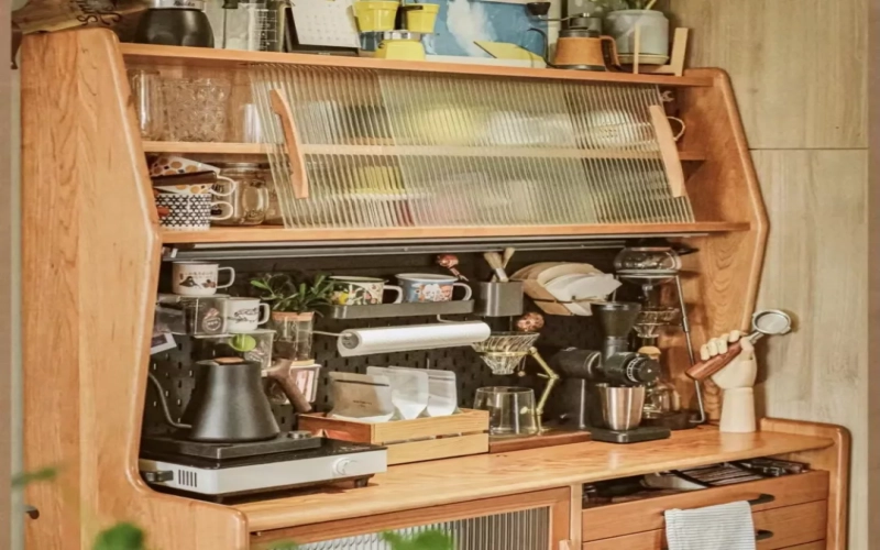
The pandemic has changed people's consumption habits, accelerating the shift of coffee bean purchases to online channels. In an increasingly competitive e-commerce environment, packaging design has become an important bargaining chip for coffee brands to stand out. Designers from 99designs by Vista, a global forum for freelance creators, discussed coffee bean packaging styles for 2022 and predicted six design directions that could dominate the market this year: serene style, text-solo style, laser style, eco-friendly style, collage style, and playful style. These styles respectively respond to consumers' current demands for inner peace, intuitive information, visual impact, sustainable development, and a relaxed atmosphere, providing valuable references for coffee brands' packaging decisions. [more…]
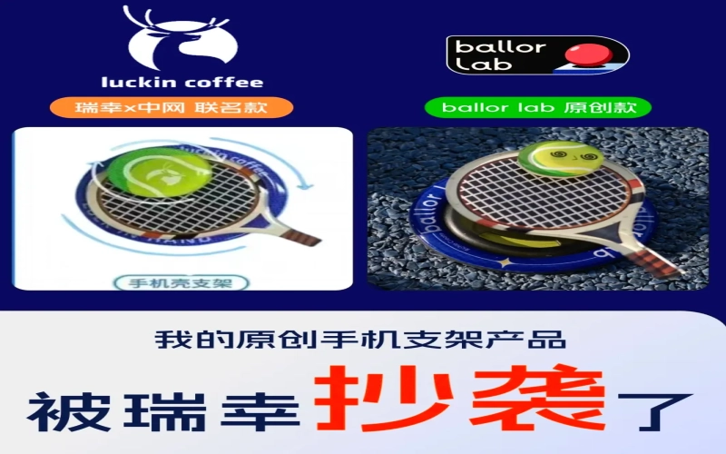
Luckin Coffee's collaboration merchandise with the Chinese tennis association has been accused of plagiarism, with the phone stand and pillow designs raising suspicions.
Luckin Coffee recently launched a co-branded campaign with the China Open, only to unexpectedly get caught up in a plagiarism controversy. An original designer posted on social media, accusing Luckin's co-branded phone case stand of being highly similar to their own work from last year, with details from the color scheme and the tennis-spin concept to the font on the base being almost identical. Meanwhile, another sports brand also discovered that its promotional image for a tennis pillow was strikingly similar to Luckin's merchandise, and after comparison, netizens pointed out that the tag position, plush texture, and even the stitching were exactly the same. As the incident continued to escalate, a wave of questioning flooded Luckin's official comment section, but as of press time the brand had yet to respond. This is not the first time Luckin has faced such accusations, and this controversy has dealt a blow to its co-branded marketing image. [more…]
The Origins of the Syphon Coffee Maker | Who Invented and Designed the Syphon? What Are the Flavor Characteristics of Syphon Coffee and Pour-Over Coffee?
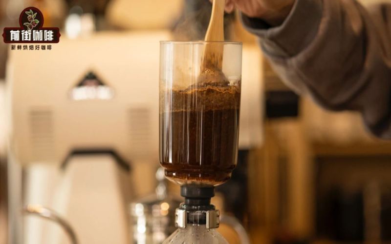
The appearance of the siphon coffee maker is just like the scientific instruments of scientists from hundreds of years ago seen in history books, with a classical aura. In fact, the siphon coffee maker really has a history of about 200 years. Who designed and invented siphon coffee? The basic principle of the siphon coffee maker is to use the phenomenon of vacuum siphon. [more…]
Tims' 60th anniversary limited edition ceramic mug gets criticized: recreates the paper cup seam design, silicone lid is hard to use and quality control is called poor
Tims, a Canadian coffee chain brand that has been in the Chinese market for five years, recently celebrated its 60th birthday. To mark the occasion, Tims launched a six-week promotion offering 9.9 yuan deals every week, along with a campaign where purchasing designated set meals would earn a limited-edition 60th-anniversary themed ceramic cup. Three simply designed cups attracted many fans to place orders in support. However, after receiving the actual products, some consumers discovered issues such as vertical protrusions on the cup body and silicone lids that were too tight to fit. Complaints flooded social media platforms. The official explanation stated that the protrusions were a deliberate design mimicking the seams of paper cups, but this clever idea did not gain widespread approval. Brand CEO Lu Yongchen once said the company would accelerate upgrades centered on user needs. Judging from the feedback on this anniversary gift, Tims still has room for improvement in peripheral product quality control and experience. [more…]
Combo Cup Shatters When Heated, Sparking Debate: Why Isn't a Device Designed for "One Bean, Multiple Brews" Heat-Resistant?
The "one bean, multiple brews" combo format has been appearing frequently on coffee shop menus in recent years. A pairing of one americano and one latte has caught many consumers' attention. However, the hulu combo cup designed specifically for combos has been exposed for quality issues — some netizens reported that the glass cup suddenly shattered while they were warming it, and customer service explained it was caused by excessive temperature difference. The merchant's product description did not indicate any usage restrictions or temperature tolerance range, which led many coffee enthusiasts to question: is a cup that can't even hold hot water really suitable for making coffee? This article will walk you through the origins of the combo, the original design intent behind the equipment, and this debate over aesthetics versus practicality. [more…]
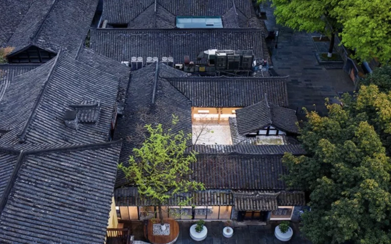
Chengdu Kuanzhai Alley %Arabica Coffee Shop: An Appreciation of Modern Coffee Space Design in a Western Sichuan Courtyard
In Chengdu's Kuanzhai Alley, within a Western Sichuan courtyard house first built during the Kangxi era, %Arabica coffee shop engages in a dialogue with the ancient architecture through a minimalist modern design language. The designers retained the original wooden structure and reinforced it with steel, paving the pathways and seating areas with gray bricks, allowing the café to blend seamlessly with the blue bricks and dark tiles. In the central courtyard, stones, floor-to-ceiling glass, and water lily leaves create the imagery of a "water pool," which not only continues the traditional feng shui symbolism of gathering wealth but also reduces the actual maintenance difficulty. The pure white bar counter blends with the building's natural tones, and as guests move through the space, the spatial experience flows and shifts accordingly. This café not only serves coffee but also lets people feel the fusion of history and modernity in the tranquility of old times. At the end of the article, there is also information about Front Street Coffee's specialty beans, which is worth the attention of coffee lovers. [more…]
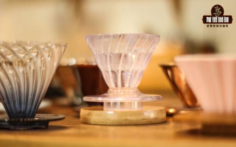
Which filter cup should beginners choose for pour-over coffee? A complete analysis of V60 filter cup brand selection and design principles
Faced with the dazzling array of dripper types on the market, beginners often don't know where to start. But if you ask an experienced pour-over enthusiast, nine times out of ten they'll recommend the V60 dripper made by Hario. Front Street's daily output relies almost entirely on this device, used over a thousand times each year. So what exactly makes the V60 stand out among so many drippers? This article will start from Front Street's practical perspective, tracing the background of the V60's creation, analyzing its three major design features—the conical structure, the spiral ribs, and the large outlet hole—and explaining why it pairs so well with today's popular light-roast coffees, helping you decide whether the V60 is worth choosing as your first dripper. [more…]
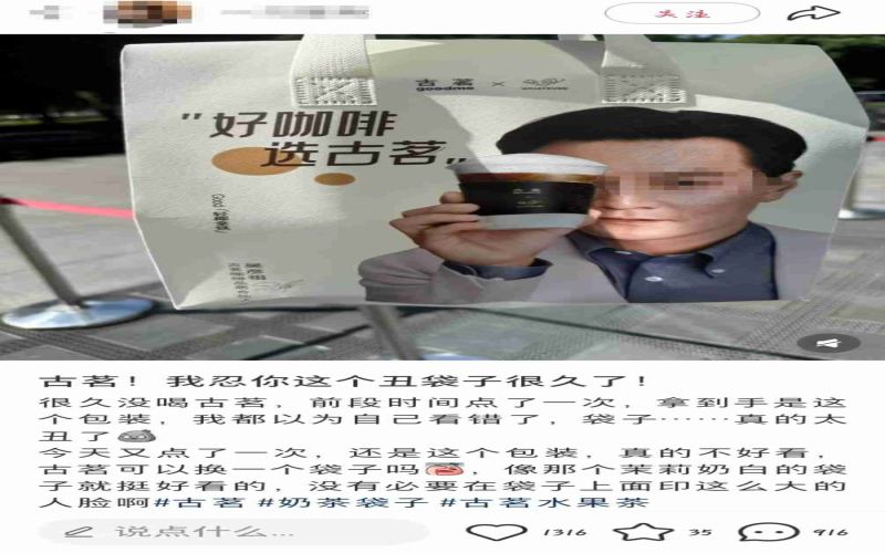
Guming's Wu Yanzu co-branded packaging bag sparks controversy: Consumers complain the design looks like health supplement packaging, brand responds feedback has been noted
After collaborating with actor Daniel Wu to promote coffee products in late June, Guming Tea recently rolled out packaging bags featuring his image at stores nationwide, which unexpectedly sparked widespread dissatisfaction among consumers. Many customers complained on social media that the bag design was "not aesthetically pleasing" and that the celebrity's portrait was too large, saying carrying it felt like "health supplements for middle-aged and elderly people" or "soaking goji berries," and some even said they wanted to throw it away as soon as they received it. Some netizens argued that although Daniel Wu has high national recognition, he is no longer young and does not fit the positioning of a youthful tea beverage brand; others pointed out that the brand should consider scenarios for secondary use of the packaging. On September 23, Guming staff responded that they had not received related complaints, but would record opinions on the design and spokesperson and pass them on for evaluation. The incident reflects the tension between co-branded packaging and the aesthetics of young consumers. [more…]
From Coffee Cherry to Chemical Formula: Are Baristas' Tattoos a Passion or an Identity?
Tattoos were once seen as a symbol of rebellion, but today they have become an important way for young people to express their beliefs and commemorate what matters to them. For baristas, wearing coffee cherries, portafilters, latte art patterns, or even the chemical formula for caffeine on their skin is both a display of personal aesthetics and a heartfelt declaration of devotion to the coffee craft. This article rounds up the tattoo themes most commonly seen on baristas, from classic equipment to creative combinations, and also addresses an intriguing question: does having more tattoos mean you make better coffee? The answer may be more rational than you'd imagine. [more…]
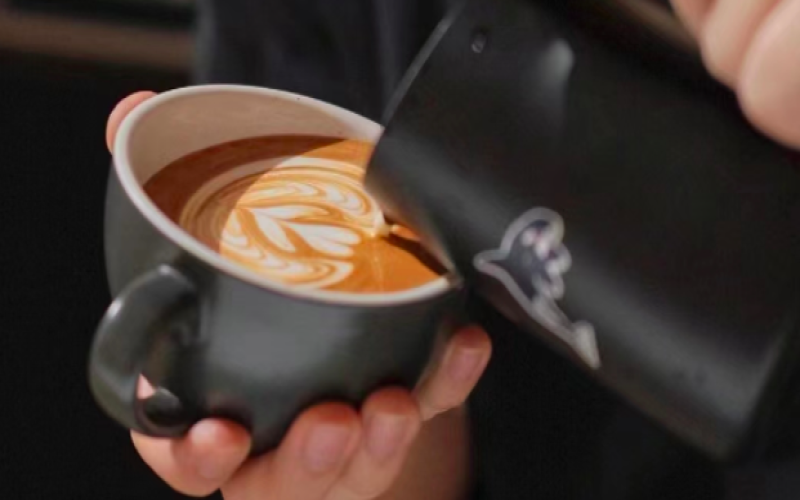
Latte Art Fails: Can You Really Serve These Bizarre Designs to Customers?
Creating latte art for customers at the bar is a daily routine for many baristas. When regulars ask for more creative patterns, some baristas begin to boldly experiment, only to create bizarre works that are both amusing and absurd. From memorial flower coupons to Cantonese insects, from Plants vs. Zombies to broken hearts, these patterns, though unique, make one wonder: can they really be served at the table? Latte art should enhance a good cup of coffee, but overly obscure creations may only be suitable for personal memes. This article will show you those latte art fails that make people both love and fear them, while preserving Front Street Coffee's professional recommendations for coffee culture. [more…]
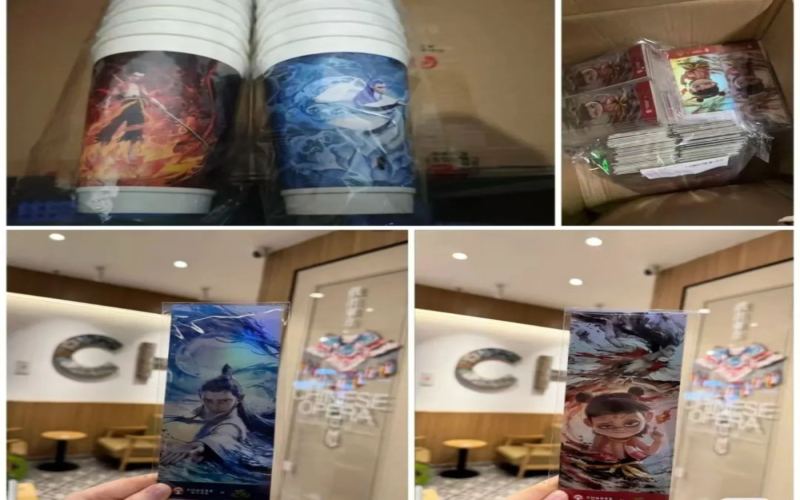
Chagee's Nezha 2 collaboration merchandise accused of clashing with Cotti Coffee designs; official denial seeks to soothe fan sentiment
The co-branding campaign between Chagee and "Ne Zha 2" had not yet been officially announced, but a large number of leaked merchandise images had already surfaced on social media, sparking heated discussion among fans. However, as more images were exposed, merchandise enthusiasts who had been full of anticipation discovered that the square badges in this design bore a striking resemblance to competitor Cotti's fridge magnets, and the quality also fell short of expectations, with disappointment written all over their faces. Facing the growing public discourse, Chagee's official account appeared in the comments section to debunk rumors and try to soothe fans' emotions. Meanwhile, Cotti, which was the first to launch its co-branded campaign, won praise for its sincerity and after-sales service, invisibly putting comparative pressure on Chagee. How will this co-branding controversy unfold? And what gaps exist between fans' expectations and the brand's preparations? [more…]